
Odoonabii Watershed Stewards
Branding & Identity
Design
Odoonabii Watershed Stewards are a group of like-minded inviduals that have come together to foster and steward the care of the water and lands we love to call home.
The vision for the Odoonabii Watershed Stewards’ logo is a mosaic of symbolism, skillfully integrating elements that embody the organization’s mission. At the core of the logomark lies a subtle yet powerful location icon, symbolizing a return to ‘home’ and the heart of Odoonabii. This emblem not only pays homage to the organization’s roots but also acknowledges the significance of location and map systems, bringing balance to the overall design.
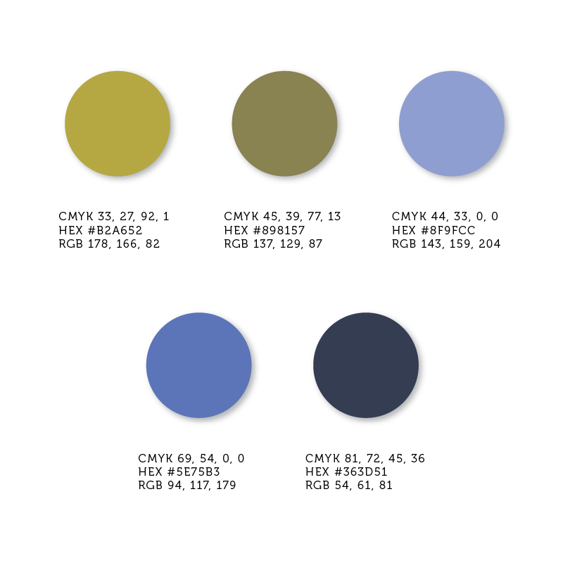
The waved lines within the logomark represent the harmonious meeting of land and water, symbolizing motion and reflecting the dynamic nature of the watershed. Paired with the Museo typeface, which balances professionalism, elegance, and approachability, the logo embodies the Stewards’ commitment to conservation with a welcoming spirit. A subtle nod to the letters within OWS adds a creative touch, and the earthy color palette, chosen for its accessibility, uniquely represents the theme of land and water. In its entirety, the logo is a testament to the thoughtful fusion of design elements, capturing the Stewards’ dedication with an air of professionalism and approachability.


Odoonabii Watershed Stewards Scope of Work
Deliverables
- Logo & Visual Identity
- Short Brand Guidelines
Kindest Clients
Dylan and the Odoonabii Watershed Stewards were great to work with and continue to be an influence on my visual arts practice.


